This is a Print Handbook

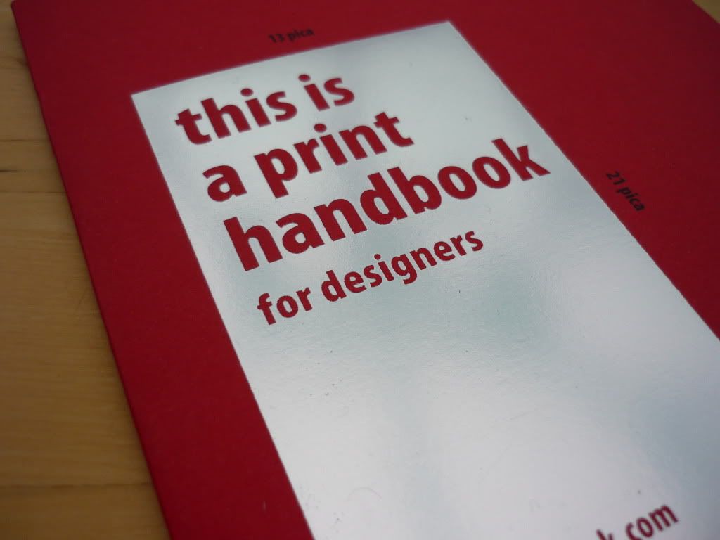
Last Wednesday I blogged about the print handbook. Earlier this week my little delivery arrived and I finally have my hands on my own copy. I still believe that it is a really useful reference tool to have and definitely feel I got my £4's worth.


Along with the booklet, an extra bit of information regarding paper weight conversions and more fold types was thrown in on the back of my invoice. 

You can follow the people that make this on Twitter (@printhandbook) where they post regular print tips.

How to Survive The World Cup

Over the Summer holidays, before the second year of university started, we were asked to create four zines. One of the zines had to be a response to the 2010 world cup. I let out somewhat of a groan upon hearing this brief as I thought I'd be able to escape the whole thing what with already having a holiday booked towards the end of the championship. Luckily I managed to get round watching most of the games (even though my boyfriend at the time insisted we watch every one in the hotel's bar) by creating a 'how to' guide in surviving/avoiding the world cup with a football-mad partner.


I do cringe slightly now when I look back at this. What on earth was I thinking with my choice of font?! I did enjoy this brief though in the end. It was a laugh coming up with different ways in avoiding the football. Some suggestions however were too rude and sadly didn't make the zine!

Muster

Muster is the final conception for a magazine we had to create based around collections. I decided upon making a supplement for The Sunday Times featuring a various array of known and unknown collections with a section focused on the weird and wonderful.

This was a great brief to experiment with layout and typography.

Information is Beautiful

Towards the end of our first year, we came across Information Graphics (infographics); visual representations of information, data or knowledge. This was pretty much an open brief where we could pick any topic, piece of research, etc. and create our own infographic poster.

I chose to look at how many miles your supermarket-bought roast dinner accumulates before reaching your plate. Using images of each separate component to the Sunday roast, I molded them into the shapes of their origin to easily pinpoint geographical location. A key at the bottom right of the page shows the food miles of each ingredient and an overall sum.


We used David McCandless' book, Information is Beautiful as reference for this project.