3rd Year Matters

Today marked the beginning of the end; my final year at the University of Gloucestershire. We've been moved to a new campus, and thus a new building, which I have to say I'm pretty impressed with. There's still the issue of having to share design space with the 1st and 2nd years, but we've been assured that we get priority of what has been dubbed the 'Chat Room'. A room that's either too hot or too cold (though I'll admit it's a lovely big and open space).

I have my first one-on-one tutorial on Wednesday morning with our course leader. We're running through our self-initiated briefs and hopefully picking out the best of the bunch to begin working on ASAP.


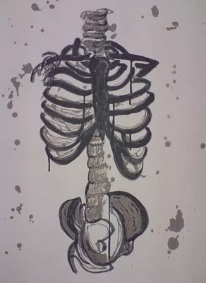
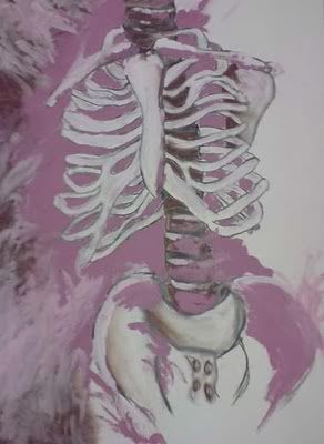
So this is where it all begins. First brief has been set and now the ball is rolling. I've got to be super organised this year, even more so than usual. My walls will no doubt end up covered in lists of things that need ticking off. But I really want to do my absolute best this year, and even a little bit extra.

Dentures

I was contacted by the supervisor of the X-ray department at the Birmingham Dental Hospital and asked whether I'd produce a purely visual sign/handout to help tackle the language barrier problem they sometimes come across with patients. I needed to create something that would inform the patient that they needed to take their dentures out before having their x-ray done.

This was a great opportunity for me as I'd get my work seen publicly. I wanted to give the hospital staff and patients something fun and engaging whilst also keeping in mind that it needed to be understood by someone that doesn't speak English very well.

I did a few sketches, but wanted to dive straight into this task. I kept the design simple and used a a few hints of colour to highlight the most important parts of the image. 


It didn't take me long and I was really pleased with the final result. The feedback I got off the staff was brilliant and I hear the signs have been used to great effect.

Typography Study: Caslon

As part of the first year we had workshops once a week where we were taught skills in using Adobe software and were set tasks to check on our learning progress throughout the module. One of the tasks we were given during a session was a case study into a particular typeface. Not only was this going to test our skills using InDesign, but also how we dealt with layout, kerning, etc.

I was given Caslon and immediately fell in love with the contour of the lowercase 'c'.


I'd like to do a few more case studies on different typefaces like this in the future as I believe it could be really helpful when trying to find the right font for a particular piece of work. It would be great to have a catalogue of pages, like this Caslon one, to get an idea of each different element of the font.

Decadence

Our first live brief was handed to us in the last week of my first year at university. It was quite a thrill, but somewhat nerve-wracking knowing that we would have to make sure the standard of quality was at its very best and that we would have to be impeccable with our timing and organisational skills.

We were asked to create an A1 poster for the Cheltenham Science Festival 2010 with the theme for the festival being 'Decadence'. I had no idea at first what this word even truly meant and when I went to research into the meaning I found myself being confused even more. This caused a bit of an issue at first when trying to come up with ideas, but after a good sit down with my sketchbook and pen I started to understand.

The final idea that was chosen focused on the decadence of one's self. How the human race have so many needs and demands to fuel their luxurious lives that we are slowly destroying our planet. I saw the final piece as having two sides to decadence; one being luxurious and rich, the other being the decline and deterioration of the earth thanks to our own lifestyles.


This was the final image that we went with - a luxurious hand trying to support the deteriorating earth. Originally the image had a smaller flame but I was told that it looked too small and resembled the Olympic torch more than anything. Also I tried the image with smoke instead of flames to show that the earth had already been scorched, but that meant the message of the image would change. It would have said that we'd already damaged the earth instead of in the process of doing so. In the end the above image won and although I'm not entirely pleased with the overall look I'm pleased what was managed in the time-space we had considering my skills at the time were fairly limited.

Title; The Path To Global Destruction.
Collaboration with Louise Ball.

F is for Futuristic

This was a short brief given to make us think about letterforms. We were all given individual letters and numbers to take away and come up with a theme relating to whichever one we had received. I was quite anxious as to what I'd end up with as I didn't like the idea of getting a number or a letter such as 'V' or 'Z'.

After being handed over the bit of paper with 'f' scrawled upon it, I immediately started thinking of themes beginning with my letter that I could try and work into the shape. Time and time again I was being drawn back to my idea of doing something futuristic. It wasn't an obvious choice and I knew I'd be able to do something really creative with it. All I had to do now however was find a font that would fit with my theme and that I could mould into a futuristic figure. To do this I visited dafont and scrolled through many a page to find something that fit within my theme. Then I came across Alien Lines.


The lowercase 'f' was perfect for the futuristic figure that I wanted to create. The circular head of the 'f' looked to me like the head of a robot, bowing down in sadness or misery. This was the font I would use for my A2 sized letterform. 


My robot came out exactly how I wanted. You can see from above that I used the Alien Lines 'f' shape as the basis of the design and decorated my figure accordingly. He was made using cardboard, silver wire, aluminium foil, grey paint and black marker pen.

No Friends But Empty Chairs

My first ever taste of a Graphic Design brief was at college during the Pathway Stage of my foundation degree. We were all given a large booklet of quotes (which I still have at hand incase it comes to call) and were asked to pick the most interesting to us. One that stood out. For me it was "No Friends But Empty Chairs." It was that idea to me of being in a crowded room full of people, yet you still felt alone.

The concepts I began coming up with were shot down pretty much straight away by my tutor at the time. She said they were too easy and that she simply hated them. I had the determination after that to go away and prove that I could do something better. In the end I produced this:


At the time I was so pleased with the outcome. I loved everything from the type to the colours I'd chosen. However, this was my first time dealing with typography and I believe my lecturers now might have something to say about the placement of some of the words and legibility of the paler text on the image of the chairs. It's nice though to look back at past work, like this piece, and compare to how I work today. A lot has been learnt over the past couple of years and I feel that my confidence in design has grown too.

Visual Studies

This was a class that I took as part of my BTEC National Diploma in Art & Design at college. Although it was a couple of years ago now I still think about it and how much I loved every single class. I used to wish that we'd have a whole day in the studio instead of a couple of hours once a week.

Drawing has always been a part of me, but I feel that those couple of hours a week I used to get really helped to develop my skills. I learnt that speeding up my drawing process made for a more interesting and different style of illustration which I still put into practice and use in my work today. It was also the place where I had my first ever life drawing experience.

My favourite pieces are two illustrations I did on the skeleton.

Black ink and hot wax // Acrylic paint, pastels, conté and charcoal.