Hot Off The Press

... well shortly anyway!

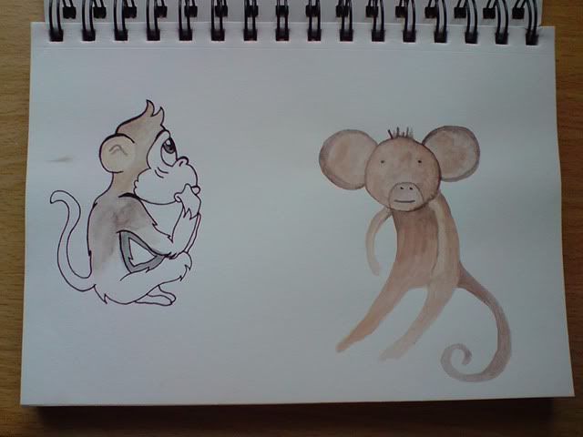
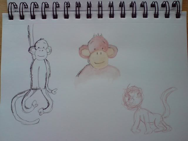
Finally sent off my book today to Blurb to get printed. It took me a good hour to actually hit the 'Order Book' button due to my absolute fear that it's not going to come out well. However I've been assured by a few people that their previous experience with the company has been a good one so my faith is resting on that. I'm printing my own anyway as a back-up just incase it doesn't get shipped to me before my deadline, or if it does turn out to be dire. Must be optimistic though.

Felt a great sense of pride when I'd uploaded my book on to their website. It just looks so professional!


I also have the option to make my book available to the public to buy if I ever feel like putting it out there. For now though I'm just looking forward to seeing how it comes out. Playing the waiting game is going to be the hardest part. Can't wait to feel it in my hands!

Typography Study: Flixonase

For this brief we had to take a set of instructions for a nasal drop product and re-arrange into a typographical layout which would be easier and more appealing to read. We were set free reign with the wording of the instructions so could remove parts that we felt weren't necessary or took up too much room.

I have to admit that I did struggle with this brief at first. Having not dealt with typography as such for a while, I wasn't quite sure on where to go with the layout and what was really being asked of us. However after a good chat with my lecturer I managed to make a start on re-wording the text and began placing it all in what I felt would be an easy-to-follow layout.

 
The first five instructions that appear are how to use the product and the remaining two are how to apply the medicine. I felt that these two different parts of the instructions needed to be separated and I believe I did this effectively with the bold text going horizontally across the page after the fifth instruction. To the right of the instructions are some bold captions which are the warning part of the instructions. I wanted to place them next to the relevant step so that the reader doesn't skim over them and miss important information.

I used Myriad for the font as it is legible and keeps that 'clean' look to the work. 

Healthy Food, Healthy You

My first taste of a self-initiated brief came during my second year at university. Our module 'Self Authorship' was a way of getting us to think outside of the box. We were told to start off by thinking about something, looking into things that interest you or that are going on around us. Basically we could enquire into anything. Although this might seem the ideal brief, I really struggled with it. Where would I start? What would I look at? And more importantly were my interests good enough for me to use as a starting point?


I think the hardest part of the project was not being allowed to think of a concept straight away. Warned against ideas, we had to keep enquiring into everything - gather new information and ask questions. In the end I settled upon something that was (and still is) quite relevant to me. My final outcome was to produce an informative booklet showing the benefits of certain types of foods for our body and how we can help prevent damage that occurs through choosing the right kinds of food.

Work in Progress

Had a rather productive day locked up in my room. Back into standard 'hermit' mode after a whistle-stop tour home to see the family. Really enjoying my project, and for once I'm not feeling completely stressed out. Trying to keep a calm head and I think it's helping with managing to get my 'to-do' list checked off easily enough.


Apologies for the bad photo (was using my phone camera), but this is one of the illustrations for my book. Along with a bit of text, which I'm still undecided about at the moment, it will highlight the areas of the room which are dangerous for children, i.e. the open fire.

Got another day of drawing ahead of me tomorrow after our morning course chat. Definitely hoping to get the remaining of my images done by latest Wednesday so I can do final layout adjustments ready to send to print at the end of the week!

Going Bananas Over a New Brief

I'm into my third week of my GRD 311 brief; self-initiated design. My choice for this module is to produce an educational children's picture book targeted at ages 3-6. Over the past year I have gained a new role in life as Auntie to a cheeky little boy. Since before he could crawl he was always trying to go places. With this in mind, I decided upon a book that teaches young children the rights and wrongs within a household - hazards and dangers. Hoping that through my illustrations and inspiration from my nephew's cheeky personality, I will be able to create a book that will easily teach what items around the house can cause injury.


I shall be using my nephew as the basis to my main character, turning him into the cheeky monkey that he is. I have started experimenting with different styles of monkey, hoping to find the best one that suits the story and overall feel of the book. I wish to keep it simple with hand-drawn illustrations.


I am setting my story in five different areas of the house; kitchen, bathroom, living room, stairs and garden. Having struggled with where to begin with each page of my book, I have decided to tackle the biggest of my illustrations - the backgrounds. Spending my afternoon playing around with these and seeing where it will lead me in terms of layout and aesthetics.