This is a Print Handbook

Last Wednesday I blogged about the print handbook. Earlier this week my little delivery arrived and I finally have my hands on my own copy. I still believe that it is a really useful reference tool to have and definitely feel I got my £4's worth.


Along with the booklet, an extra bit of information regarding paper weight conversions and more fold types was thrown in on the back of my invoice. 

You can follow the people that make this on Twitter (@printhandbook) where they post regular print tips.

How to Survive The World Cup

Over the Summer holidays, before the second year of university started, we were asked to create four zines. One of the zines had to be a response to the 2010 world cup. I let out somewhat of a groan upon hearing this brief as I thought I'd be able to escape the whole thing what with already having a holiday booked towards the end of the championship. Luckily I managed to get round watching most of the games (even though my boyfriend at the time insisted we watch every one in the hotel's bar) by creating a 'how to' guide in surviving/avoiding the world cup with a football-mad partner.


I do cringe slightly now when I look back at this. What on earth was I thinking with my choice of font?! I did enjoy this brief though in the end. It was a laugh coming up with different ways in avoiding the football. Some suggestions however were too rude and sadly didn't make the zine!

Muster

Muster is the final conception for a magazine we had to create based around collections. I decided upon making a supplement for The Sunday Times featuring a various array of known and unknown collections with a section focused on the weird and wonderful.

This was a great brief to experiment with layout and typography.

Information is Beautiful

Towards the end of our first year, we came across Information Graphics (infographics); visual representations of information, data or knowledge. This was pretty much an open brief where we could pick any topic, piece of research, etc. and create our own infographic poster.

I chose to look at how many miles your supermarket-bought roast dinner accumulates before reaching your plate. Using images of each separate component to the Sunday roast, I molded them into the shapes of their origin to easily pinpoint geographical location. A key at the bottom right of the page shows the food miles of each ingredient and an overall sum.


We used David McCandless' book, Information is Beautiful as reference for this project.

Maximum Meaning, Minimum Means

This morning saw a guest lecture from Naomi Games, daughter of Graphic Designer Abram Games.


Before today I hadn't really a clue of who he was, or the work that he had done throughout his life. I recognised a few of the pieces shown but it's not until you hear the story behind the master of poster design that you really get an idea of the work.

It was great being able to hear how he came about some of the final designs for his posters and the reasoning behind why he accepted some of the jobs - one being because he liked the look of the woman's legs! Through seeing his work right from the beginning to the end, it was clear to see how much of his own style he had, and also to learn his thoughts regarding the designing process; if they "don't work an inch high, they will never work." The idea being asserted that if it works well and looks good small, then it will look just as good, if not better, at a larger scale.


These four posters of his really stood out to me in the lecture. I was so impressed with the idea of the envelope in the 'Air Mail' poster being used to represent the 'A' and 'M' of the two words. Such a simple idea, yet showcased so brilliantly. It really is the simplicity in his work that I think really speaks to people. His philosophy of wanting to be able to communicate a message through the visual imagery only (without any type) is one to follow. You're doing a good job if you can create an image that doesn't need words to explain what it means/does.

The final thing to note is the 3 C's each Graphic Designer should have - concentration, curiosity, courage (and not to forget the cash and the cheques too!). 

Manifesto

A public declaration of principles, policies, or intentions, especially of a political nature.


Our second module during the first year was to create our own personal manifesto. Not only was this brief to make us think about how we would present and layout our individual manifestos but also make us think carefully about what work ethics we had, if any.

As inspiration and a guide for this brief we were told to look at the manifesto of designer, Bruce Mau. Being completely lost on direction with this at first, I found Mau's manifesto really useful. I had never before thought about my values as a designer.


I pastiched my design from the Lululemon manifesto as each point stood out against all others. There was nothing being overshadowed by something else, and with a manifesto I believe you really need to take into account everything, not just a small bit of it. 

After two years I still stand by everything that makes up my manifesto. I don't think I'd add or take away anything.

Benjamin Owen, Where Are You Going?

I am pleased to announce that my first project for this final year is complete. For the past 7 weeks I have been slaving away, putting my absolute all into this first piece and I can't be more chuffed! I introduce to you all my finished product; an educational children's picture book, 'Benjamin Owen, Where Are You Going?'


The book, targeted at children aged 3-6 years, helps to show the dangers around the home focusing on five areas; kitchen, lounge, stairs, bathroom and garden. With my hand-drawn illustrations and accompanying rhyme children are able to pinpoint what hazards they see in each room, teaching them what can be harmful to their little hands.

I wish to say a big thank you to Blurb for publishing my book to such a high standard. Having never used them before I was a bit anxious as to what the outcome would look like, but I really couldn't be happier.

Currently looking into making it available to the public to buy but doing my research first for somewhere that does it at a good price. Unfortunately I find Blurb a little too pricey and even I'm put off by the prices it would be sold at.

Dimensions: 7x7"
Cover: Hardcover, image wrap
Paper: Premium Lustre 148GSM

Book Binding Stress

With the deadline of GRD 311 two days away, I had to make sure that my back-up copy for my children's book was printed and bound incase UPS don't deliver my book to me tomorrow (which I'm pretty sure is going to be the case).

In true last-minute style I came across a couple of disasters, resulting in me having three attempts of making my own copy. Thankfully I can say I managed to resolve all issues pretty swiftly and have even got my evaluation out of the way also. Only thing left to do tomorrow is sort out my presentation for Thursday's hand-in. I'm not a great public speaker so I'm not looking forward to those 3 minutes at all. I know they're just going to drag so much and tomato face is going to come into play!


When my professionally printed copy arrives I should be able to put up photographs of some of the page spreads. At the moment I'm too scared to open my printed copy in the fear that it will just fall apart in my hands.

Hot Off The Press

... well shortly anyway!

Finally sent off my book today to Blurb to get printed. It took me a good hour to actually hit the 'Order Book' button due to my absolute fear that it's not going to come out well. However I've been assured by a few people that their previous experience with the company has been a good one so my faith is resting on that. I'm printing my own anyway as a back-up just incase it doesn't get shipped to me before my deadline, or if it does turn out to be dire. Must be optimistic though.

Felt a great sense of pride when I'd uploaded my book on to their website. It just looks so professional!


I also have the option to make my book available to the public to buy if I ever feel like putting it out there. For now though I'm just looking forward to seeing how it comes out. Playing the waiting game is going to be the hardest part. Can't wait to feel it in my hands!

Typography Study: Flixonase

For this brief we had to take a set of instructions for a nasal drop product and re-arrange into a typographical layout which would be easier and more appealing to read. We were set free reign with the wording of the instructions so could remove parts that we felt weren't necessary or took up too much room.

I have to admit that I did struggle with this brief at first. Having not dealt with typography as such for a while, I wasn't quite sure on where to go with the layout and what was really being asked of us. However after a good chat with my lecturer I managed to make a start on re-wording the text and began placing it all in what I felt would be an easy-to-follow layout.

 
The first five instructions that appear are how to use the product and the remaining two are how to apply the medicine. I felt that these two different parts of the instructions needed to be separated and I believe I did this effectively with the bold text going horizontally across the page after the fifth instruction. To the right of the instructions are some bold captions which are the warning part of the instructions. I wanted to place them next to the relevant step so that the reader doesn't skim over them and miss important information.

I used Myriad for the font as it is legible and keeps that 'clean' look to the work. 

Healthy Food, Healthy You

My first taste of a self-initiated brief came during my second year at university. Our module 'Self Authorship' was a way of getting us to think outside of the box. We were told to start off by thinking about something, looking into things that interest you or that are going on around us. Basically we could enquire into anything. Although this might seem the ideal brief, I really struggled with it. Where would I start? What would I look at? And more importantly were my interests good enough for me to use as a starting point?


I think the hardest part of the project was not being allowed to think of a concept straight away. Warned against ideas, we had to keep enquiring into everything - gather new information and ask questions. In the end I settled upon something that was (and still is) quite relevant to me. My final outcome was to produce an informative booklet showing the benefits of certain types of foods for our body and how we can help prevent damage that occurs through choosing the right kinds of food.

Work in Progress

Had a rather productive day locked up in my room. Back into standard 'hermit' mode after a whistle-stop tour home to see the family. Really enjoying my project, and for once I'm not feeling completely stressed out. Trying to keep a calm head and I think it's helping with managing to get my 'to-do' list checked off easily enough.


Apologies for the bad photo (was using my phone camera), but this is one of the illustrations for my book. Along with a bit of text, which I'm still undecided about at the moment, it will highlight the areas of the room which are dangerous for children, i.e. the open fire.

Got another day of drawing ahead of me tomorrow after our morning course chat. Definitely hoping to get the remaining of my images done by latest Wednesday so I can do final layout adjustments ready to send to print at the end of the week!

Going Bananas Over a New Brief

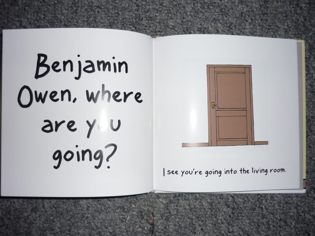
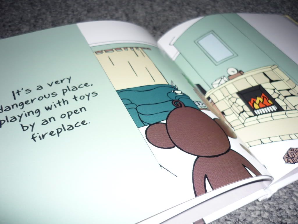
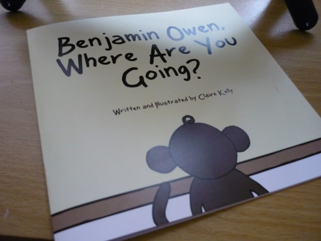
I'm into my third week of my GRD 311 brief; self-initiated design. My choice for this module is to produce an educational children's picture book targeted at ages 3-6. Over the past year I have gained a new role in life as Auntie to a cheeky little boy. Since before he could crawl he was always trying to go places. With this in mind, I decided upon a book that teaches young children the rights and wrongs within a household - hazards and dangers. Hoping that through my illustrations and inspiration from my nephew's cheeky personality, I will be able to create a book that will easily teach what items around the house can cause injury.


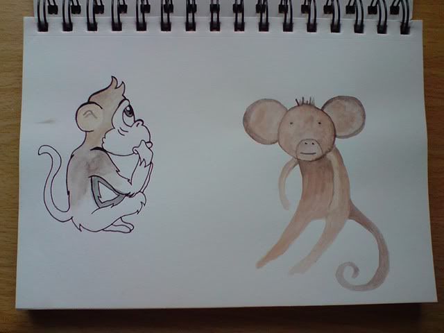
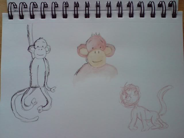
I shall be using my nephew as the basis to my main character, turning him into the cheeky monkey that he is. I have started experimenting with different styles of monkey, hoping to find the best one that suits the story and overall feel of the book. I wish to keep it simple with hand-drawn illustrations.


I am setting my story in five different areas of the house; kitchen, bathroom, living room, stairs and garden. Having struggled with where to begin with each page of my book, I have decided to tackle the biggest of my illustrations - the backgrounds. Spending my afternoon playing around with these and seeing where it will lead me in terms of layout and aesthetics.

3rd Year Matters

Today marked the beginning of the end; my final year at the University of Gloucestershire. We've been moved to a new campus, and thus a new building, which I have to say I'm pretty impressed with. There's still the issue of having to share design space with the 1st and 2nd years, but we've been assured that we get priority of what has been dubbed the 'Chat Room'. A room that's either too hot or too cold (though I'll admit it's a lovely big and open space).

I have my first one-on-one tutorial on Wednesday morning with our course leader. We're running through our self-initiated briefs and hopefully picking out the best of the bunch to begin working on ASAP.


So this is where it all begins. First brief has been set and now the ball is rolling. I've got to be super organised this year, even more so than usual. My walls will no doubt end up covered in lists of things that need ticking off. But I really want to do my absolute best this year, and even a little bit extra.

Dentures

I was contacted by the supervisor of the X-ray department at the Birmingham Dental Hospital and asked whether I'd produce a purely visual sign/handout to help tackle the language barrier problem they sometimes come across with patients. I needed to create something that would inform the patient that they needed to take their dentures out before having their x-ray done.

This was a great opportunity for me as I'd get my work seen publicly. I wanted to give the hospital staff and patients something fun and engaging whilst also keeping in mind that it needed to be understood by someone that doesn't speak English very well.

I did a few sketches, but wanted to dive straight into this task. I kept the design simple and used a a few hints of colour to highlight the most important parts of the image. 


It didn't take me long and I was really pleased with the final result. The feedback I got off the staff was brilliant and I hear the signs have been used to great effect.

Typography Study: Caslon

As part of the first year we had workshops once a week where we were taught skills in using Adobe software and were set tasks to check on our learning progress throughout the module. One of the tasks we were given during a session was a case study into a particular typeface. Not only was this going to test our skills using InDesign, but also how we dealt with layout, kerning, etc.

I was given Caslon and immediately fell in love with the contour of the lowercase 'c'.


I'd like to do a few more case studies on different typefaces like this in the future as I believe it could be really helpful when trying to find the right font for a particular piece of work. It would be great to have a catalogue of pages, like this Caslon one, to get an idea of each different element of the font.

Decadence

Our first live brief was handed to us in the last week of my first year at university. It was quite a thrill, but somewhat nerve-wracking knowing that we would have to make sure the standard of quality was at its very best and that we would have to be impeccable with our timing and organisational skills.

We were asked to create an A1 poster for the Cheltenham Science Festival 2010 with the theme for the festival being 'Decadence'. I had no idea at first what this word even truly meant and when I went to research into the meaning I found myself being confused even more. This caused a bit of an issue at first when trying to come up with ideas, but after a good sit down with my sketchbook and pen I started to understand.

The final idea that was chosen focused on the decadence of one's self. How the human race have so many needs and demands to fuel their luxurious lives that we are slowly destroying our planet. I saw the final piece as having two sides to decadence; one being luxurious and rich, the other being the decline and deterioration of the earth thanks to our own lifestyles.


This was the final image that we went with - a luxurious hand trying to support the deteriorating earth. Originally the image had a smaller flame but I was told that it looked too small and resembled the Olympic torch more than anything. Also I tried the image with smoke instead of flames to show that the earth had already been scorched, but that meant the message of the image would change. It would have said that we'd already damaged the earth instead of in the process of doing so. In the end the above image won and although I'm not entirely pleased with the overall look I'm pleased what was managed in the time-space we had considering my skills at the time were fairly limited.

Title; The Path To Global Destruction.
Collaboration with Louise Ball.

F is for Futuristic

This was a short brief given to make us think about letterforms. We were all given individual letters and numbers to take away and come up with a theme relating to whichever one we had received. I was quite anxious as to what I'd end up with as I didn't like the idea of getting a number or a letter such as 'V' or 'Z'.

After being handed over the bit of paper with 'f' scrawled upon it, I immediately started thinking of themes beginning with my letter that I could try and work into the shape. Time and time again I was being drawn back to my idea of doing something futuristic. It wasn't an obvious choice and I knew I'd be able to do something really creative with it. All I had to do now however was find a font that would fit with my theme and that I could mould into a futuristic figure. To do this I visited dafont and scrolled through many a page to find something that fit within my theme. Then I came across Alien Lines.


The lowercase 'f' was perfect for the futuristic figure that I wanted to create. The circular head of the 'f' looked to me like the head of a robot, bowing down in sadness or misery. This was the font I would use for my A2 sized letterform. 


My robot came out exactly how I wanted. You can see from above that I used the Alien Lines 'f' shape as the basis of the design and decorated my figure accordingly. He was made using cardboard, silver wire, aluminium foil, grey paint and black marker pen.

No Friends But Empty Chairs

My first ever taste of a Graphic Design brief was at college during the Pathway Stage of my foundation degree. We were all given a large booklet of quotes (which I still have at hand incase it comes to call) and were asked to pick the most interesting to us. One that stood out. For me it was "No Friends But Empty Chairs." It was that idea to me of being in a crowded room full of people, yet you still felt alone.

The concepts I began coming up with were shot down pretty much straight away by my tutor at the time. She said they were too easy and that she simply hated them. I had the determination after that to go away and prove that I could do something better. In the end I produced this:


At the time I was so pleased with the outcome. I loved everything from the type to the colours I'd chosen. However, this was my first time dealing with typography and I believe my lecturers now might have something to say about the placement of some of the words and legibility of the paler text on the image of the chairs. It's nice though to look back at past work, like this piece, and compare to how I work today. A lot has been learnt over the past couple of years and I feel that my confidence in design has grown too.

Visual Studies

This was a class that I took as part of my BTEC National Diploma in Art & Design at college. Although it was a couple of years ago now I still think about it and how much I loved every single class. I used to wish that we'd have a whole day in the studio instead of a couple of hours once a week.

Drawing has always been a part of me, but I feel that those couple of hours a week I used to get really helped to develop my skills. I learnt that speeding up my drawing process made for a more interesting and different style of illustration which I still put into practice and use in my work today. It was also the place where I had my first ever life drawing experience.

My favourite pieces are two illustrations I did on the skeleton.

Black ink and hot wax // Acrylic paint, pastels, conté and charcoal.