
Before today I hadn't really a clue of who he was, or the work that he had done throughout his life. I recognised a few of the pieces shown but it's not until you hear the story behind the master of poster design that you really get an idea of the work.
It was great being able to hear how he came about some of the final designs for his posters and the reasoning behind why he accepted some of the jobs - one being because he liked the look of the woman's legs! Through seeing his work right from the beginning to the end, it was clear to see how much of his own style he had, and also to learn his thoughts regarding the designing process; if they "don't work an inch high, they will never work." The idea being asserted that if it works well and looks good small, then it will look just as good, if not better, at a larger scale.
 |  |
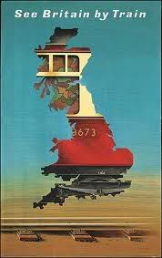 | 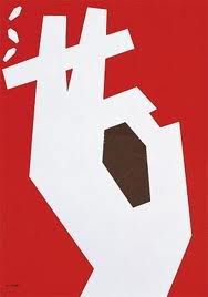 |
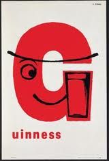
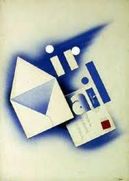
These four posters of his really stood out to me in the lecture. I was so impressed with the idea of the envelope in the 'Air Mail' poster being used to represent the 'A' and 'M' of the two words. Such a simple idea, yet showcased so brilliantly. It really is the simplicity in his work that I think really speaks to people. His philosophy of wanting to be able to communicate a message through the visual imagery only (without any type) is one to follow. You're doing a good job if you can create an image that doesn't need words to explain what it means/does.
The final thing to note is the 3 C's each Graphic Designer should have - concentration, curiosity, courage (and not to forget the cash and the cheques too!).

No comments
Post a Comment